Color Grading in Photography: How It Changes the Mood of Your Photos
Understand the principles behind color grading and discover how they shape the mood, atmosphere and visual impact of every photograph.
Color Grading in Photography: How It Changes the Mood of Your Photos
Understand the principles behind color grading and discover how they shape the mood, atmosphere and visual impact of every photograph.
Introduction
Imagine looking at the same photograph with two different edits. One version is warm and golden, evoking nostalgia and comfort, while the other is cool and muted, creating a sense of mystery or solitude. Although the subject remains unchanged, the emotional impact is entirely different. This transformation is made possible through color grading.
While camera settings determine how a scene is captured, color grading influences how that scene is ultimately experienced. By refining colors, tones and contrast, photographers can shape the atmosphere of an image and reinforce the story they want it to tell. The same photograph can evoke completely different emotions depending on how its colors are interpreted during the editing process.
Understanding color grading in photography goes beyond learning editing tools. It involves recognizing how color influences perception and using that knowledge to make thoughtful creative decisions. Whether you're developing a consistent editing style or simply refining individual photographs, understanding the principles of color grading can help you create images that feel more intentional, balanced and visually engaging.
What Is Color Grading in Photography?
Color grading is the creative process of adjusting the colors and tonal balance of a photograph to achieve a specific visual style. Unlike edits that focus on correcting technical imperfections, color grading is about creative interpretation, deciding how an image should look and feel rather than simply making it technically accurate.
Every photograph already contains a natural color palette influenced by the available light, camera settings and the surrounding environment. Through color grading, photographers refine these existing colors to strengthen the atmosphere of the image while maintaining a cohesive visual style. Depending on the creative intent, the same photograph can be edited in several different ways with each version conveying a unique visual character.
Color grading is typically performed after essential editing steps such as exposure adjustments, white balance and color correction. Once the photograph has been technically refined, photographers use tools such as the HSL (Hue, Saturation and Luminance) panel, Tone Curve and Color Wheels to refine individual colors, balance tonal relationships, and develop a cohesive visual style.
Unlike technical corrections, there isn't a single "correct" way to color grade a photograph. Two photographers editing the same RAW file may arrive at entirely different results based on their artistic preferences, the lighting conditions or the purpose of the image. This flexibility is what makes color grading an essential part of modern photography, allowing photographers to develop a visual style that reflects their creative vision rather than simply reproducing what the camera captured.
Color Correction vs Color Grading
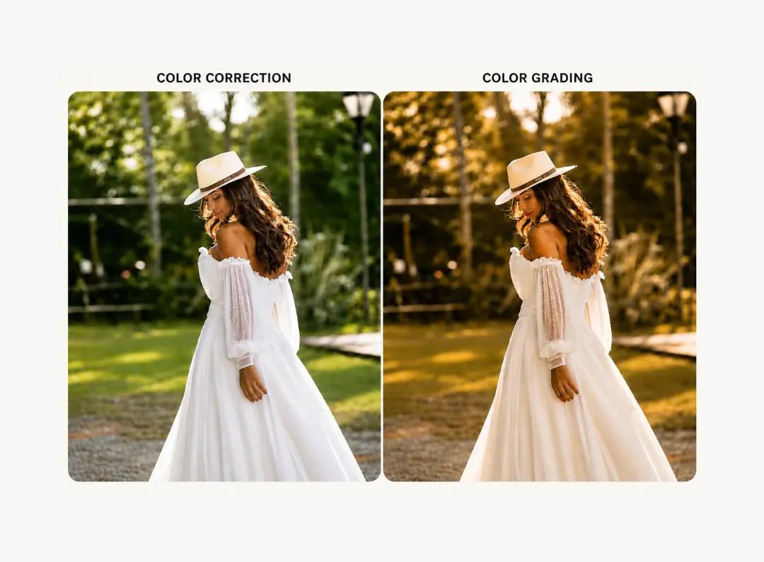
Although the terms color correction and color grading are often used interchangeably, they serve different purposes in the editing workflow. Understanding the distinction is important because effective color grading begins with a technically accurate photograph.
Color correction focuses on restoring an image to a natural and balanced state. During this stage, photographers adjust elements such as exposure, white balance, contrast and color accuracy to ensure the photograph closely represents the original scene. The goal is to correct technical inconsistencies caused by lighting conditions, camera settings or lens characteristics.
Once these adjustments are complete, color grading becomes the creative stage of editing. Rather than correcting the image, photographers intentionally refine its colors and tonal relationships to establish a specific mood, atmosphere or visual style. This is where creative decisions shape the final appearance of the photograph.
Applying color grading before correcting an image can lead to inconsistent or unrealistic results, as creative adjustments often amplify existing color or exposure issues. By establishing a clean and balanced foundation first, photographers gain greater control over the final look while maintaining natural skin tones, accurate highlights and harmonious colors.
In simple terms, color correction ensures a photograph is technically accurate, while color grading shapes how the final image is perceived. Together, they form the foundation of a professional editing workflow.
The Key Elements of Color Grading
Effective color grading isn't created by a single adjustment. Instead, it comes from combining several elements that work together to shape the overall appearance of a photograph. Understanding how each one influences the image helps photographers make deliberate editing decisions rather than relying solely on presets.
White Balance
White balance determines the overall warmth or coolness of a photograph. A warmer white balance can create a sense of comfort, intimacy or nostalgia, while cooler tones often convey calmness, distance or a more contemporary feel. Small adjustments can significantly influence the emotional impact of an image without altering its composition.
Contrast and Tonal Adjustments
Contrast controls the relationship between highlights, midtones and shadows affecting how depth and dimension are perceived. Increasing contrast can create a bold and dramatic look, while softer tonal transitions produce a more natural or airy appearance. Finding the right balance ensures the image remains visually engaging without losing important detail.
HSL (Hue, Saturation and Luminance)
The HSL (Hue, Saturation and Luminance) panel allows photographers to adjust individual colors without affecting the entire image. Hue changes the color itself, saturation controls its intensity and luminance influences its brightness. These adjustments are often used to refine skin tones, enhance landscapes or create a more cohesive color palette.
Tone Curve
The Tone Curve provides precise control over the brightness and contrast of different tonal regions. Rather than making broad exposure adjustments, photographers can selectively brighten highlights, deepen shadows or fine-tune midtones to create a more balanced and refined image.
Color Wheels
Color Wheels allow photographers to adjust the color balance of highlights, midtones and shadows independently. This makes it possible to introduce subtle color contrast, unify the overall palette or establish a distinctive visual style while maintaining a natural-looking result.
Although each of these tools serves a different purpose, they are most effective when used together. Successful color grading is rarely achieved through a single dramatic adjustment. Instead, it comes from a series of deliberate refinements that enhance the photograph while preserving its natural balance.
What Influences Color Grading Decisions?
There is no universal approach to color grading. The adjustments that work for one photograph may not suit another even if they were captured in the same location. Every editing decision depends on the image itself and the story the photographer wants to communicate.
Lighting Conditions
The quality, direction and color of light play a significant role in determining how a photograph should be graded. Images captured during golden hour often benefit from preserving their natural warmth, while photographs taken under overcast skies or artificial lighting may require different adjustments to achieve a balanced and visually appealing result.
Subject Matter
The subject also influences color grading decisions. Portrait photographers often prioritise accurate and natural-looking skin tones, while landscape photographers may focus on enhancing the relationship between the sky, foliage and foreground. Product and commercial photography typically requires colors that remain consistent and true to the brand or product.
Creative Intent
Color grading should always support the purpose of the photograph. A documentary image may require subtle adjustments to maintain authenticity, whereas a fashion or fine art photograph may embrace a more stylised approach. The goal isn't to apply a particular look but to choose colors that reinforce the mood and message of the image.
Consistency Across a Collection
Photographers rarely edit images in isolation. Wedding galleries, travel collections and commercial projects often include hundreds of photographs viewed together. Maintaining a consistent color palette across the entire collection creates a cohesive viewing experience and reflects a professional editing style.
Rather than following trends or relying on presets, experienced photographers evaluate each image individually before making adjustments. The most effective color grading decisions are guided by the available light, the subject and the story the photograph is intended to tell.
Common Color Grading Mistakes to Avoid
Color grading is as much about knowing what to avoid as it is about knowing which adjustments to make. Even small editing decisions can influence how natural, balanced and believable a photograph appears.
One of the most common mistakes is applying excessive saturation or strong color shifts in an attempt to make an image more striking. While bold colors can be effective in certain styles, pushing every adjustment too far often distracts from the subject instead of enhancing it. Subtle refinements usually create a more polished and timeless result.
Another common issue is overlooking white balance before making creative adjustments. If the overall color temperature is inaccurate, every subsequent edit is built on an unstable foundation, making skin tones, highlights and surrounding colors appear unnatural.
Relying too heavily on presets can also limit the quality of a final image. Presets are useful for maintaining consistency and speeding up workflows, but they aren't designed for every lighting condition or scene. Thoughtful photographers treat presets as a starting point, making further adjustments based on the individual photograph rather than applying the same look universally.
Above all, effective color grading should enhance a photograph without becoming the centre of attention. When editing choices support the subject instead of competing with it, the final image feels more natural, balanced and visually compelling.
Conclusion
Color grading is more than a finishing touch in the editing process. It's a creative tool that shapes how a photograph is experienced. By thoughtfully adjusting color, tone and contrast, photographers can strengthen the atmosphere of an image, guide the viewer's attention and create a consistent visual style.
While editing software offers countless tools and creative possibilities, effective color grading isn't about applying dramatic effects or following popular trends. It begins with understanding the photograph itself, its lighting, the subject and the story it is meant to tell, then making deliberate adjustments that enhance rather than overpower the image.
As your understanding of light, color and visual storytelling develops, so will your ability to make more confident editing decisions. Rather than searching for the perfect preset, focus on mastering the principles behind color grading. The result will be photographs that not only look visually appealing but also communicate your creative vision with clarity and consistency.
Publish on:
Written By
Sreelakshmi S V
Digital Marketer
Subscribe to our newsletter
Publish on:
Written By
Sreelakshmi S V
Digital Marketer